Transhuman Design IS ‘Experience Focused Engineering’. Why? Admittedly, I’m coining this definition or phraseology; but it goes to what I do for a living and helps explain that to people outside the field. Further, this definition quantifies a philosophical approach that has been developing in the fields of User Experience Design and Software Engineering and Industrial hardware design and the like. Numerous trends are coming together and the products and services that are standing out are the ones focused on design.
Just take software for example. From a software engineering perspective, most things that can be done have been done in a general sense; it is only through the engineering focused experiences that delight the user that a software product can get any light at all. This underlying pressure towards better software design goes to the point in a quote I heard, “If you have to explain a user interface then it’s wrong”.
Technology is here, it is around us, it is part of us and a focus on going beyond design to an experience focused engineering methodology helps you as a ‘designer’ excel above your peers and standout; to ‘transcend’ and extend humanity using technology and THAT is why I call it ‘Transhuman Design’ or ‘Experience Focused Engineering’.
Current Market Trends
From a professional standpoint, it is important to note that as raw engineering becomes increasingly outsourced and processes becomes increasingly automated for numerous things, from engineering to production and any number of other things; what is increasingly important (at least in the western world) professionally is the ability to integrate better design and better or ‘cooler’ ways of doing or designing and building things to be able to standout. It’s not the best engineered product but the best design that users enjoy using and notice how much they are delighted by the ‘feel’ and other emotionally aesthetic considerations. While strictly speaking not logical, it does lend itself to higher quality and new and unique design. It is in this ‘space’ that the idea of ‘Transhuman Design’ becomes the differentiating factor, where form and function and beauty are taken to new levels.
It is in design, as an engineer, that the big salaries and the money will be made over the next decade.
What will it take to stand out?
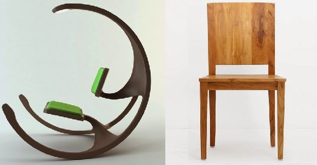
What will it take to stand out? Let’s take a look at a few examples, starting with a chair. Will this first chair or second chair sell? Which will get people excited to use, to not just sit but have the honor of sitting on?
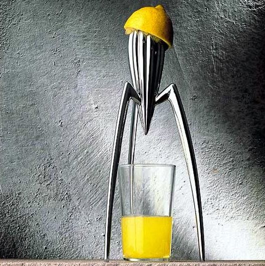
Or take this juicer? Would you take a boring old fashioned juicer or this one?
Or, more importantly, let’s talk about computers … did you know the iPad was not the first touch slate? Does anyone even remember any other before the iPad? I’m sure a few might; but society doesn’t. Industrial design taken to the next level is what we need to learn; applied to all things. In my small segment of the world, it is about user interface design and Transhuman design is the art and science of being better than other design.
Design and engineering
So how do you take interface design above the fray? Both Microsoft and Google have tried, in part, to illustrate this evolution in increasingly better design. Both companies realize that only with design being better then what we’ve had before can either product be successful. Let’s take a look at some of these ideas:
Philosophically Microsoft says,
“We’re honest about our medium: a connected, digital world. We celebrate this world with vibrant and dynamic typography, color, and motion. We stay away from ornamentation or decoration.
We imagine, design and create experiential products and services that enhance and enrich the lives of millions.
We work in a collaborative fast-paced workspace with whiteboards, stickies and design concepts lining the walls of our design studios. We rely on each other’s diverse skills and backgrounds to generate and explore ideas, and ultimately evaluate their potential impact. We work hard but always have fun along the way.”
In terms of design, they translate this conceptually to guiding principles including: design that should be fast and fluid, authentically digital, do more with less (meaning the less on the screen the better), pride in craftsmanship; it really is about motion design, the use of typography and high contrast for readability and from here you get into specific windows related design rules that you can learn more about here:
Design.micosoft.com and design.windows.com
Now Microsoft was first in going down this road as a company but Apple has adopted their own version of this and Google put in the effort to develop a similar design language. Google calls this ‘Material Design’ and describes it philosophically as,
“‘Focus on the user and all else will follow.’ We embrace that principle in our design by seeking to build experiences that surprise and enlighten our users in equal measure. This site is for exploring how we go about it. You can read our design guidelines, download assets and resources, meet our team, and learn about job and training opportunities.
We challenged ourselves to create a visual language for our users that synthesizes the classic principles of good design with the innovation and possibility of technology and science. This is material design. This spec is a living document that will be updated as we continue to develop the tenets and specifics of material design.”
While Google describes Material Design as a metaphor, when it comes to implementation it includes ideas like being ‘Bold’, ‘Graphic’ and ‘Intentional’. The same ideas of typography, white space, contrasting color, edges and simplicity go to the same sort of ‘Modern’ or ‘Material’ design as both companies like to talk about. This recognition for the trend to better design and even ‘transhuman’ design is just the foundation.
Design and engineering of human machine interfaces, as really that is what we are talking about, is something that requires a multi-disciplinary approach and experimentation. Getting design in front of users to test if what you’ve done makes sense and getting inside the mind of the user and what they want to accomplish and making it so you don’t even need to explain the UI is really where you need to be. Remember if you ever have to explain how your user interface works then you have failed at Transhuman Design.
Going back to the experience focused design at the beginning all of this really goes to engineering experiences. This is true even for business problems; where numerous user inputs, and getting input on emotional, visual and other aspects of the design, go into this holistic, or engineered, approach to user experience design. Then it becomes possible to really do ‘Transhuman Design’.
Summary
The only way to differentiate is better design delights and helps technology become part of the background and part of us. If you’re in the field, delight with the obvious and make the world better because what you built is better than anything ever done before; even if it is for accounting or another line of business application. ‘Transhuman Design’ will help blur the line between humanity and the machine.
References:
http://www.creativebloq.com/product-design/examples-industrial-design-12121488 (11/30/2013)
* hero image used from Cyberlife.Transhumanity.net


Leave a Reply